DeskAway.com – collaborative SaaS project tracking tool
Priyanka Dalal asked me to review their business at DeskAway.com.
Category: B2B -> SaaS -> Collaborative Poject Tracking
What is it?
DeskAway.com is an online, collaboration software to track a project between team members, potentially located anywere globally.
What more?
DeskAway is a very easy to get interface with simple, step by step instructions on what all it offers, and how it can be used. The features packed application can be delight for any colloborative activity, which can be defined as a “project” form. Offered in a SaaS structure, the use of the application is easy on the pocket for users, and yet, it should earn DeskAway good money, for large scale adaption.
My Quick Two Cents:
My quick two cents are all positive! The site is done very well, with a lot of thought, and addresses a large scale requirement in terms of collaborative project work. I would believe that DeskAway wil get excellent response and is poised to be a winner.
More Wisdom Nuggets:
1. Like I have mentioned in 1 or 2 reviews earlier, my first nugget would simply be to keep up the good stuff. I think DeskAway has been built very well, and also positioned very well, so I would recommend strongly that it is kept that way, and the rewards will come.
2. I am not familiar with the competitive landscape for the business. So of course, from a feature comparison point of view, or pricing point of view, if there are any reasons for customers to consider other options, those need to be addressed by DeskAway.
3. My nuggets this time around, rather than for DeskAway, may be for other entrepreneurs, who could look at various specific elements of DeskAway and learn from the same:
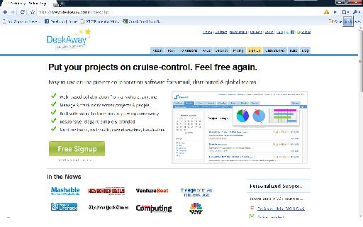
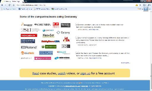
a. The home page: is very focused. Drives home the key communication at the outset. In few quick bullets – not long, drawn paragraphs. As you scroll down, there are specific horizontal sections (although not separated by any kind of separators) each of which drive home one key point, that could be critical for customers to move ahead. The identification of the key points and then, the presentation in this manner, is very impressive.
b. The overall colors and fonts used on the site are very refreshing. Easy on the eye, soothing colors, yet eye catching, enough white space there, absolutely no problem in reading the content!
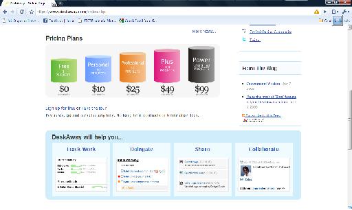
c. The individual links on the home page are again, simple, straightforward and exactly what prospects may look for. A tour of the product, FAQs, comparison with other options, pricing details… nothing left to the imagination. Quick and simple links to get you the information.
All in all, I have been very impressed with the website. I have not tried the product, but assuming the same diligent effort in the product as well (and do note this reaction – looking at a good clean site, I am giving them the benefit of doubt, without knowing, that the product will also be good; likewise if you have a great product, but the site is poorly done, a prospect may have already formed an opinion about the company, before he moves into the product area!), I have all the reasons to believe that DeskAway is going to be a brilliant success! I urge other entrepreneurs to make DeskAway a model to learn from!
GRAY SCALE RATING: 4.5 / 5.0
NoJobJitters.com – to manage your career
Val Cummins asked me to take a look at his site, NoJobJitters.com.
Category: B2C -> Recruitment
What does it do?
NoJobJitters.com intends to be a one-stop destination for job seekers, or for anyone who desires to manage his career.
What more?
The site offers several direct resources for job seekers like interview tips, job fair information, job searches, resume guidelines, etc. Additionally there are also a host of other support services covering topics like Emotional Intelligence, Work / Life Balance, Overcoming Obstacles, etc.
In other words, the site is indeed an extensive resource for job seekers, as a one stop source.
My Quick Two Cents:
While the site does appear to be an exhaustive resource for job seekers, there is much to be desired in the design and layout, to make it more compelling and attractive to users. Also like I have asked many others on this blog, “where is the money”??
Wisdom Nuggets in more detail:
1. The first thing that hit me when I opened the site was, “where am I?” There was a lot of content all over the place, and I did not know where to begin. And yet, there was no one place where I could find a quick note about what this site was about, and where all do I go from here. There is a definite need to cut the content by a whole lot on the home page.
2. There is temptation for any site owner to put a lot of information out there on the home page. After all, one never knows what specific item a particular visitor would need?! You know what, you can carry this thought to an extreme.. what if you put your entire site on the home page?? You can’t do that, can you? Likewise, you can’t put so many links on the home page.
3. What you need to do is to figure out your best bets. For the rest, perhaps just put titles. And of course, there is Ajax to the rescue. An interested reader could mouseover or click the particular link of interest and see the details right there and then. That is highly recommended here.
4. Also the color combination needs to be rethought. A dark blue background and a lighter blue text on top of it, is not the most easy on the eyes. While there is merit in trying to be “different” so that people will remember your site, it cannot be done at the cost of making it harder to read content on your site. There is indeed a lot of merit in using a lighter background and a darker color text. Just stay safe on some of these basics of website design!
5. “Where is the money??”! Really.. where IS the money? If there are chargeable services, they are hidden away deep inside. Most everything seems to be free. Yes, we all know Google did it that way. But really they had invested heavily into a technology that would be so compelling that people will throng there in the millions, and ulimately, there will be ways to monetize those. If there is a recruitment site, with a good compilation, but with otherwise, not a whole lot of differentiation, and at least not something which is a serious entry barrier for others to replicate.. now, that is not a fomula to invest a lot of money in giving a free service. You are clearly incurring cost in making and managing this site. How long will you do it free of cost? How are you expecting to make money, even later? Don’t lose the focus on that critical piece of the puzzle. If there IS a strategy, well and good. If you hope that things will figure themselves out, well, they don’t. You figure them out!!
In summary, I can say that NoJobJitters.com has a good effort in compiling a large number of resources and creating community, and also offering new and fresh news and information, for job seekers. So its a great service. They do need to figure out a way to serve their own selves. Like make some money out of it. Good luck!
GRAY SCALE RATING: 2.5 / 5.0
Been busy working on my own business.. !
I have not been able to do reviews on startups in recent days. The reason for this is that I have been busy working on my own business! And that takes priority over reviewing others’ businesses 🙂
But no, I love doing these reviews, and I hope to restart soon, and carry on doing a few reviews regularly.
Please bear with me, folks!!


